Margaret Pentrack
"It’s incredibly difficult to capture the essence of a place, encapsulate 150 years of history, and convey Durham’s energy for the future. Kompleks’ beautiful design work did all of that—in a logo alone."

Celebrating 150 years through Shared Prosperity
Since its inception, Durham has served as a hub for innovation. From tobacco to education, healthcare and technology, the people of Durham welcome challenges by building creative solutions. In celebration of 150 years, the community launched 150 projects to further the path of shared prosperity.
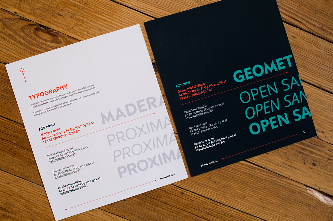
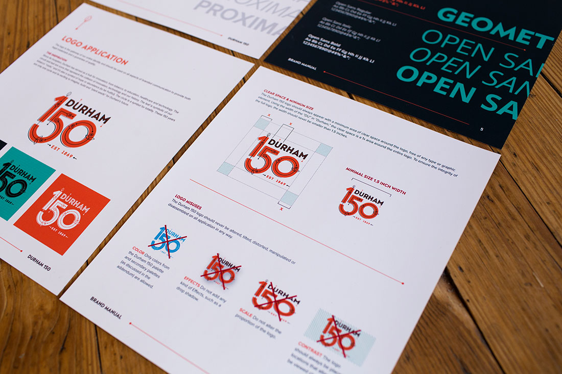
When Kompleks Creative was asked to work on the initiative’s logo design, the first thing we did was identify icons that represent Durham’s history and future. We believed that the circuit and leaf represent the collision of innovation and technology within our history. The leaf symbolizes our tobacco “roots,” faith, values and abundance. The circle is a symbol for totality, a cycle and timelessness. We experimented with a warm color palette reminiscent of brick buildings and wood flooring in our old commercial districts. Our goal was to create an illustrative logo that wasn’t safe because Durham goes against the grain.
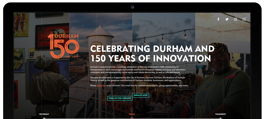
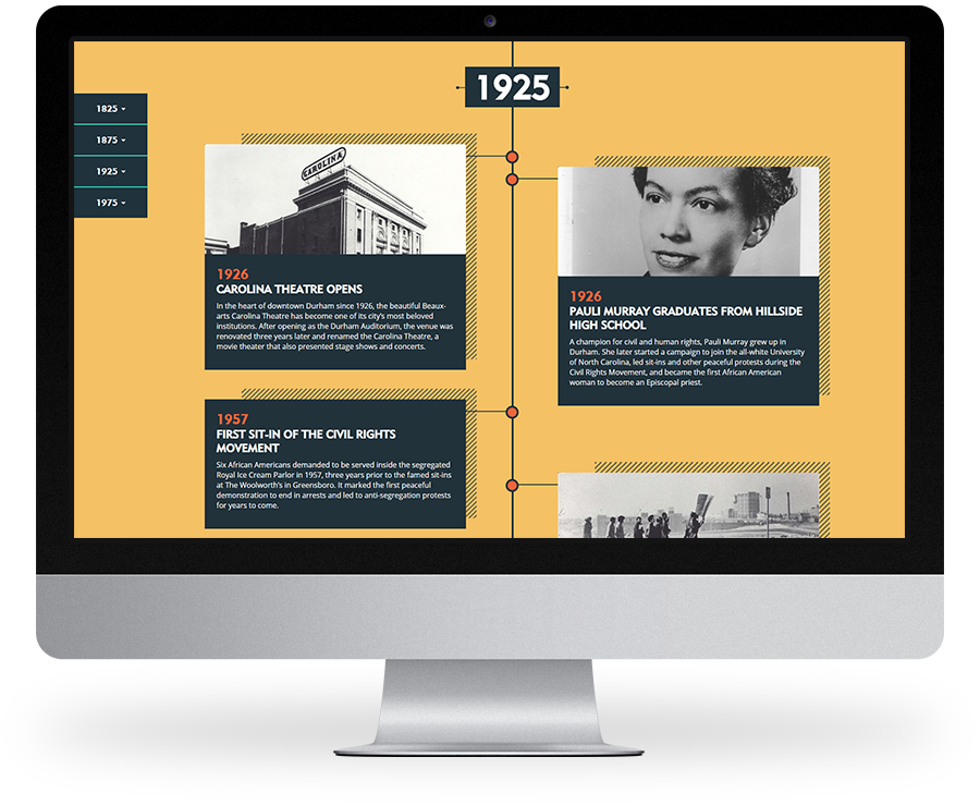
Since the website was the first design that utilized the logo, Kompleks used this as an opportunity to discover the mechanics of logo use. As we designed the website, the client was in the process of figuring out how they wanted to build the Durham 150 narrative. Our team delivered a website that was flexible, but also spoke to who and what Durham was.


SOCIAL